My Role
As a 'generalist' UX designer at cXstudio, I work in a cross-disciplinary team in Agile and Scrum sprints.
I worked in different kinds of projects - simple and complex re-designs, compliancy projects with very fixed requirements, and strategic UX in projects with early design involvement (these are my favorites).
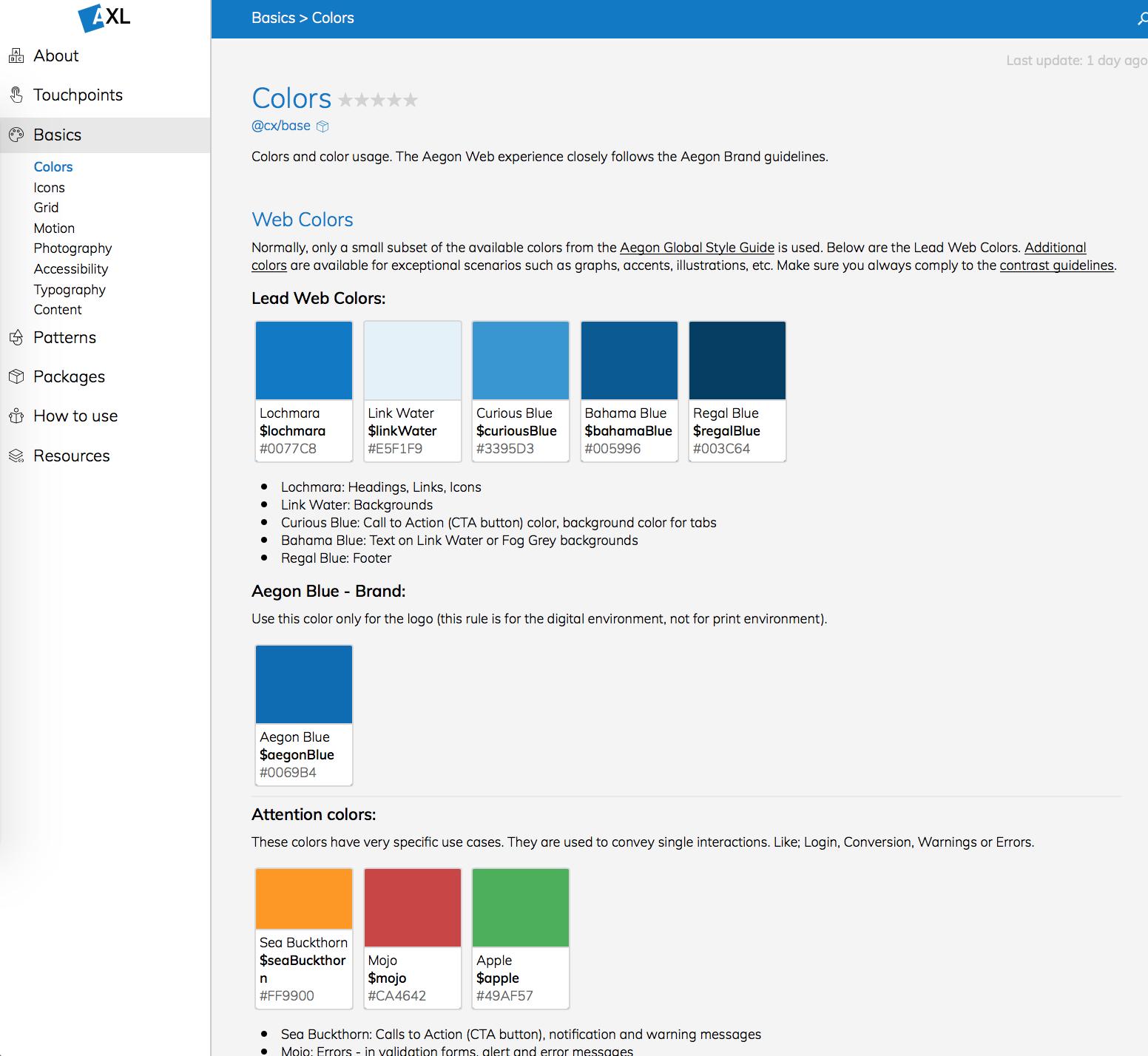
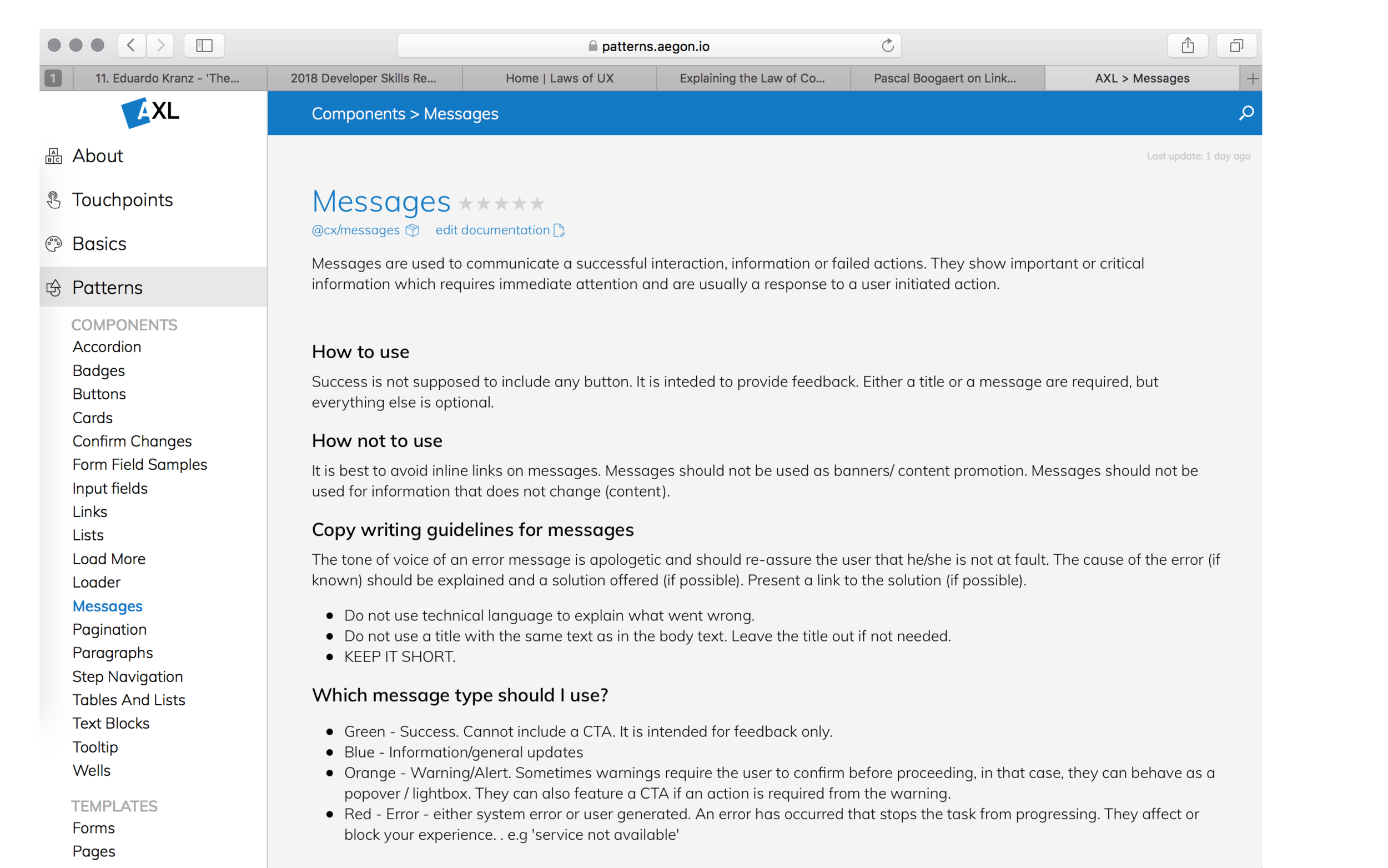
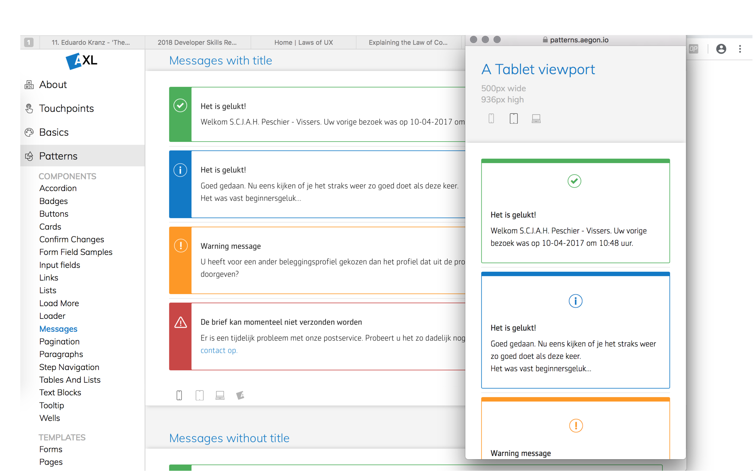
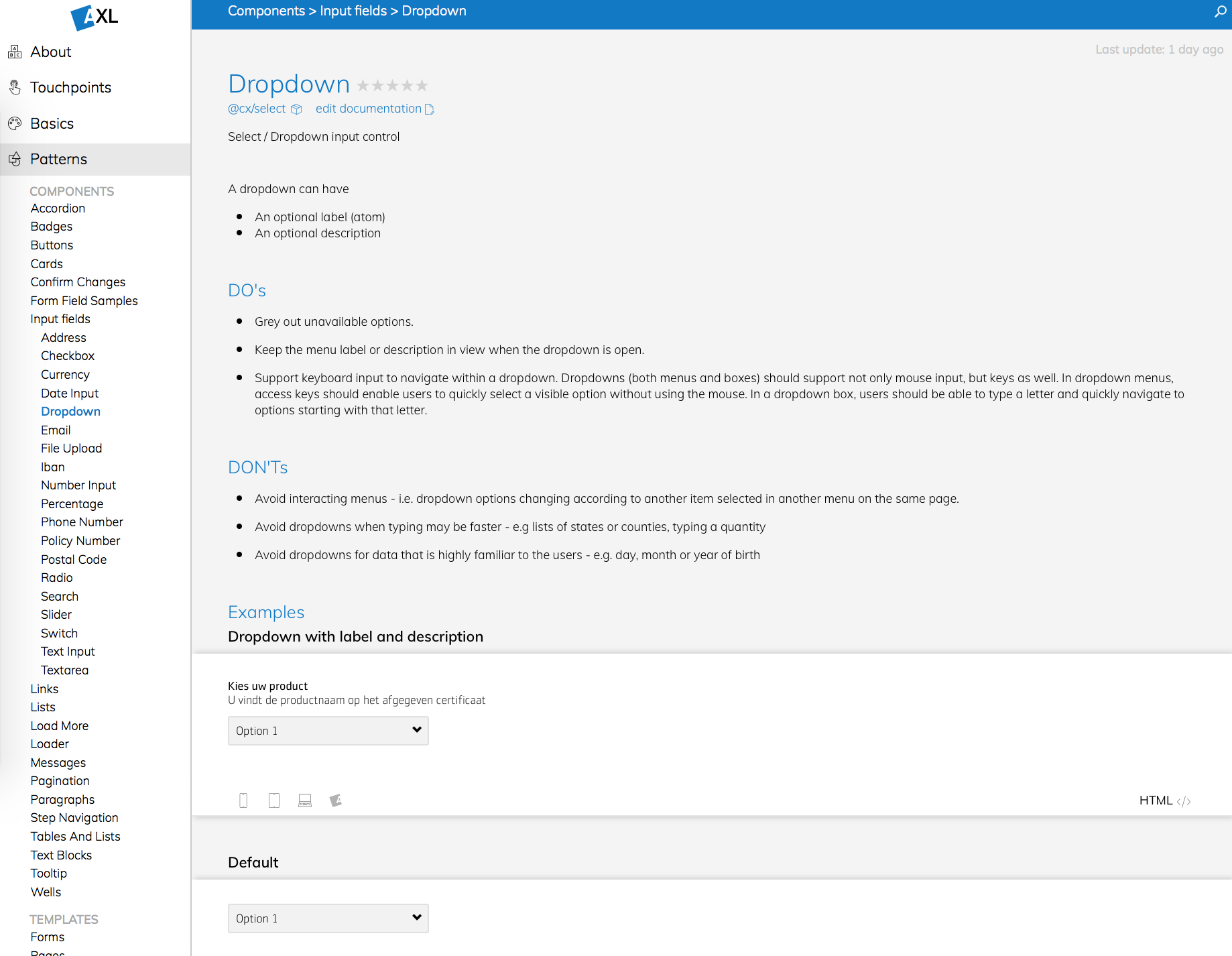
Together with the fantastic guild of UX designers and UX researchers, we collaborate to constantly improve our way of working, for example by creating a Pattern Library and addressing accessibility issues.
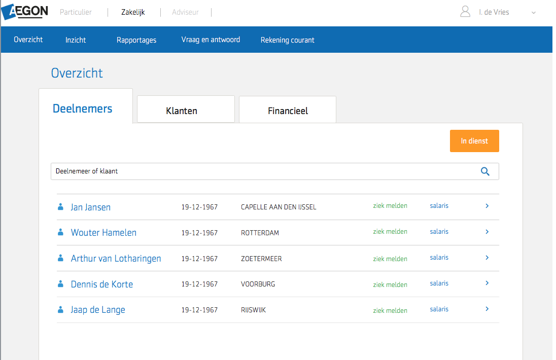
Areas I have worked in cover Mijn Aegon self-services, Pension, and administration portals for Advisors and Employers.
Sketch
Axure
Illustrator
Photoshop
Jira
Git Hub
Google Analytics
User Research
User Testing
Requirement Definition
Prototyping
Metric Definition
Style Guides
User Journeys
Storyboards
Flow Diagrams
Wireframing
Workshops
Roadmaps
Strategic planning
some projects i worked on

Claims routing
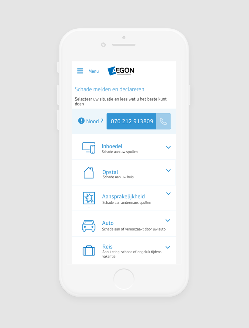
Problem: Aegon has many business lines and products, with different journeys and steps both for users and within the company. It is not easy for the customer to find the right channel.
There is a correlation between a confusing user experience and volume of calls.
Users would like to find the right channel fast. Having a user read a description of all available options and only then selecting the right one for the situation was not efficient or user friendly.
Solution: To help users find the right journey for their claims as directly as possible, we mapped each of these journeys and adopted a 'conversational' approach to route users to their right action.
Once the user has selected the option that applies to his/her situation, a series of questions brings him/her to the right option for the situation (repair-shop, online report, phone, liability).
This conversational approach performed much better in A/B testing than a static copy based approach, had more positive user feedback and generated less phone calls.
Static copy approach
Early iteration for more dynamic, conversational approach. User flow depends on their answers.
call reduction
Goals: Reduce calls
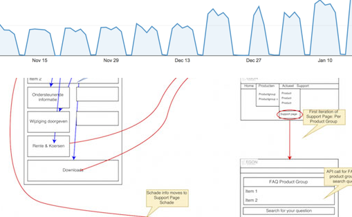
Problem: Customers cannot find relevant information and call instead. Calls are expensive, and time consuming for users.
Why are users calling? : First assumption: Information architecture is not clear, there is no clear path to helpful information. There is outdated and irrelevant information and walls of text. Contact number is very easy to find, but Help information is hard to find.
Checking assumptions: We worked with Customer Service agents to get information regarding calls and with data analysts to understand user behaviour. There were many interesting insights, for example Google analytics metrics showed that over 50% of users were reaching the contact information numbers page directly from the home page - the route was not taking them through FAQs at all. FAQs were, in fact, harder to find and did not have relevant information.
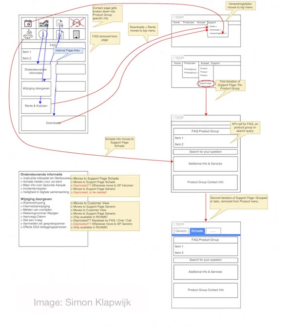
Solution: Improve Information Architecture to support clear paths to helpful information. Improve the quality of the information and prioritize it dynamically based on users' queries. Remove all outdated information. Set up new metrics, measure and optimize.
Pattern Library
One of my favourite projects at cXstudio was our Pattern Library. The goal was to bring consistency and efficiency by creating reusable components, creating solutions to recurrent design problems.
The library meant working closely together with all the designers, also involving developers, content managers, marketeers and management. We collaborated to create consistent reusable patterns and focused on improving processes.
The first stage was taking an inventory of existing elements. We took atomic design approach. I love spotting structures and behaviors that repeat, finding the structure in a system, so my contribution was mainly 'pattern hunting' and describing these patterns, working on guidelines for pattern use.
I revised all the colour palette, icons, messages and tables. We looked at different types of content blocks, defined form structure and validation, looked at page templates.
I was lucky the company supported me attending a Design System conference in Helsinki, where I got to listen to the design systems master Nathan Curtis.
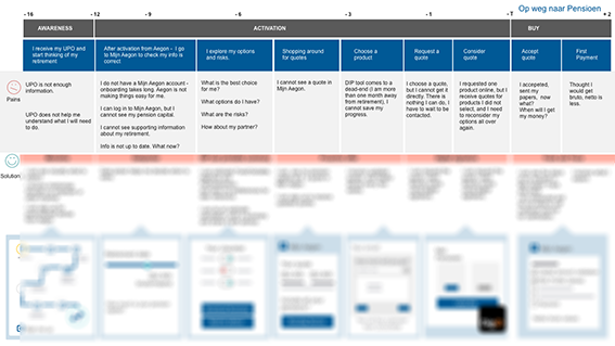
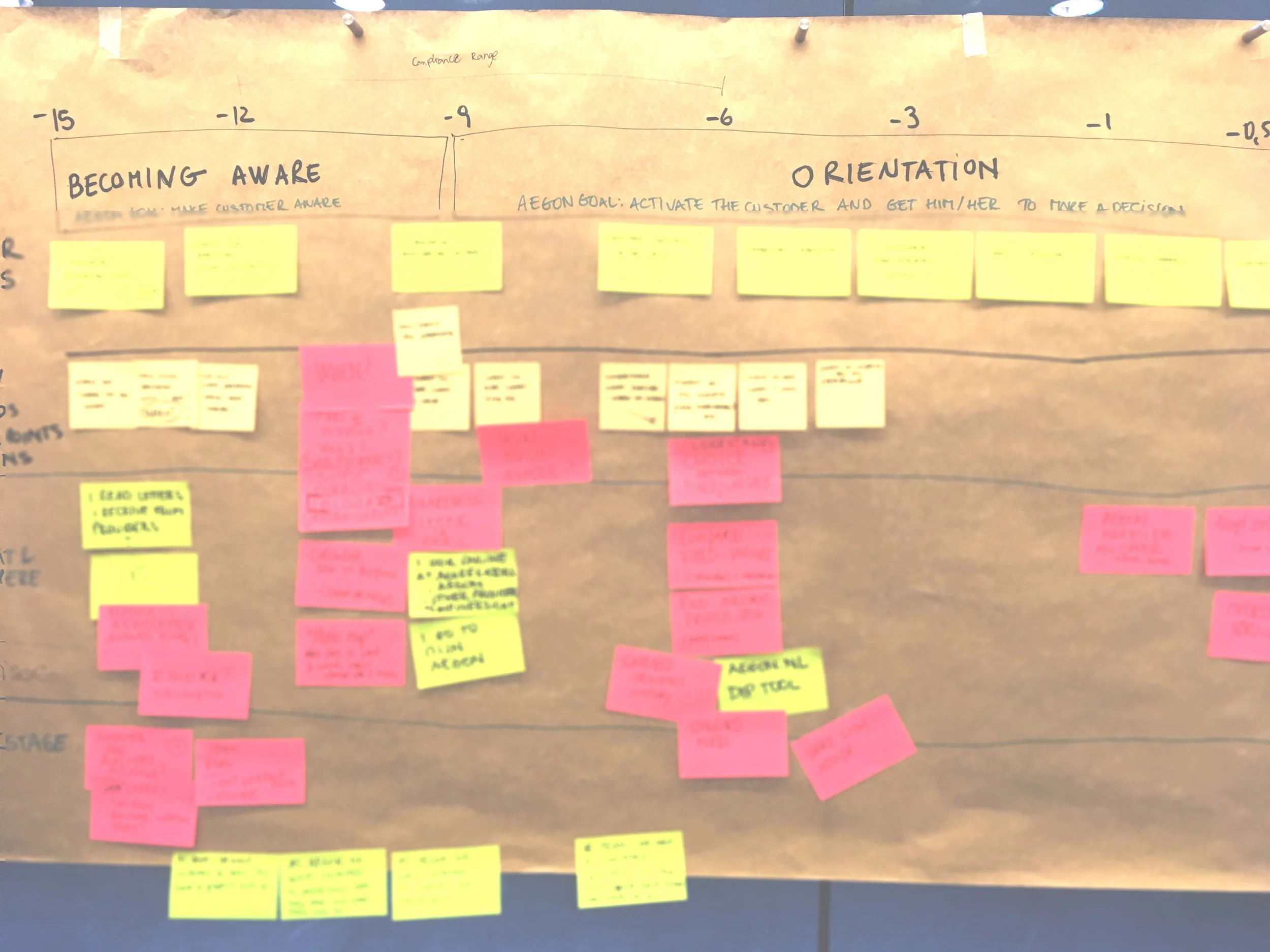
Strategic UX Workshops
I really enjoy when UX is involved early, helping shape user-centered solutions.
At cX, we used service design techniques to assist business teams in shaping and strategizing their value propositions.
For example, customer journey mapping and storyboards were really useful in clarifying the journey of customers facing retirement and having to navigate the complexities of choosing a pension plan.
This information directly supported a long term marketing strategy and the roadmap for value creation.

By visualizing a customer-focused ecosystem, business value and user value can be better aligned.
User-centricity is embedded in value planning.
When design leads by collaboration and facilitation, the shared sense of ownership brings the strength of everyone's knowledge together.
Great way of identifying gaps and operational inefficiencies
Allow for proactive identifying of opportunities
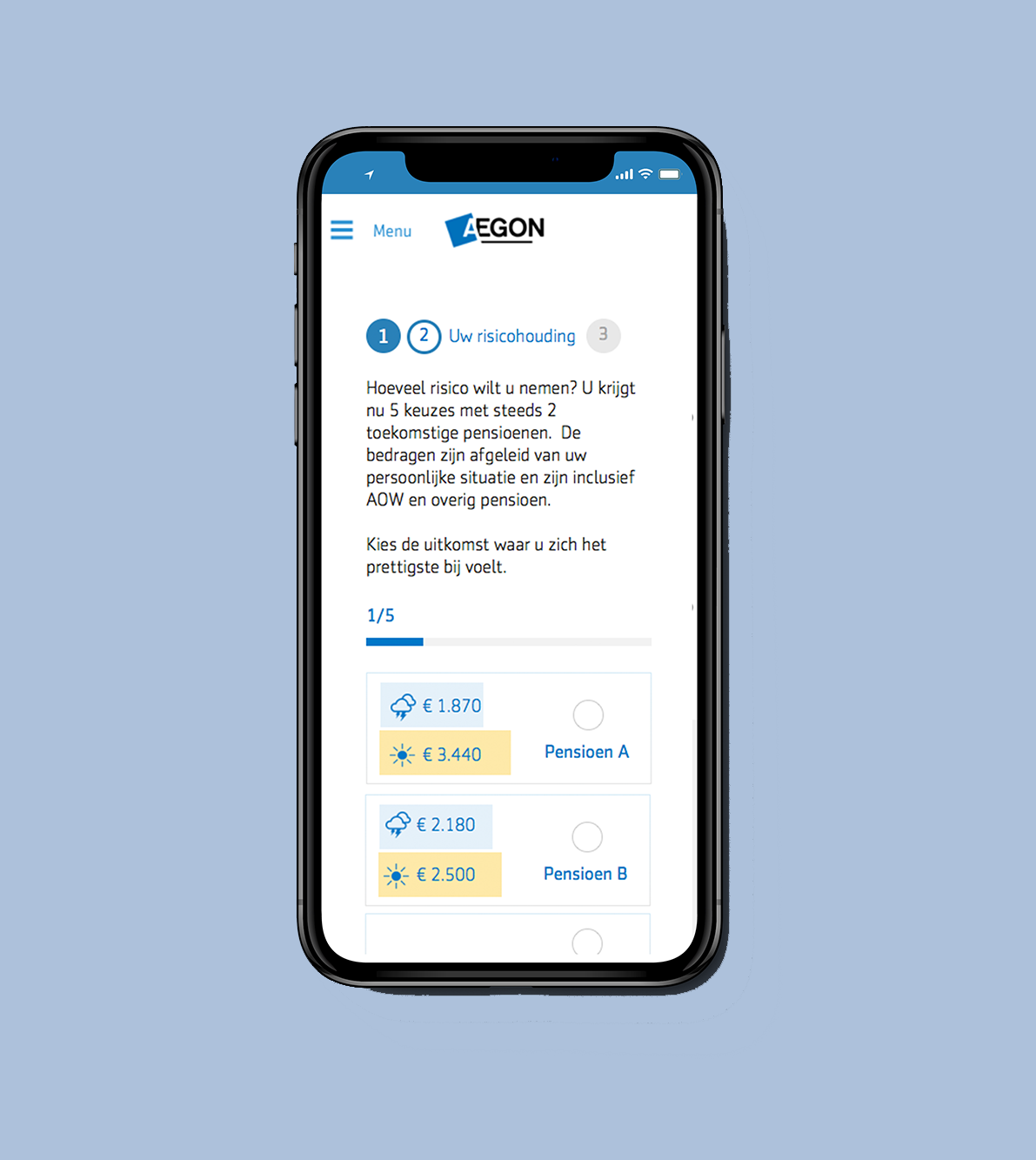
Risk Profile Assessment Tool
Problem: This project was a redesign of an existing questionnaire, with a tight dead-line, due to legal compliance reasons. The challenge was to simplify and clarify information as much as possible within the legal requirements while empowering users in making their own decisions. Understanding this type of financial information is far from easy for most people.
Solution: I made the different scenarios clearer by visualizing and comparing them. I broke the flow in clearer steps, using progress indicators and progress bars to give users an overview of the whole process, their place in it, and to encourage completion.
Old/Existing Tool
Mobile view new version
Desktop view for new version
Iteration for new version
"In November 2017, Aegon in the Netherlands won the 2017 PensioenWegwijzer (Pension Show-me-the-way) award, for the Aegon ProfielWijzer (Profile Checker). In just five minutes, Aegon's ProfielWIjzer guides soon-to-retire customers through a series of questions to determine the risk profile of their pension pot, as well as the type of income - fixed or variable. The jury said, 'This initiative demonstrates that by guiding people through their personal choices, they're prepared to take decisions that can contribute to an improved pension.'" https://www.aegon.com/en/Home/About/Performance/Company-Awards/
Income and Disability Calculator
Mobile view
Mobile view
Desktop view
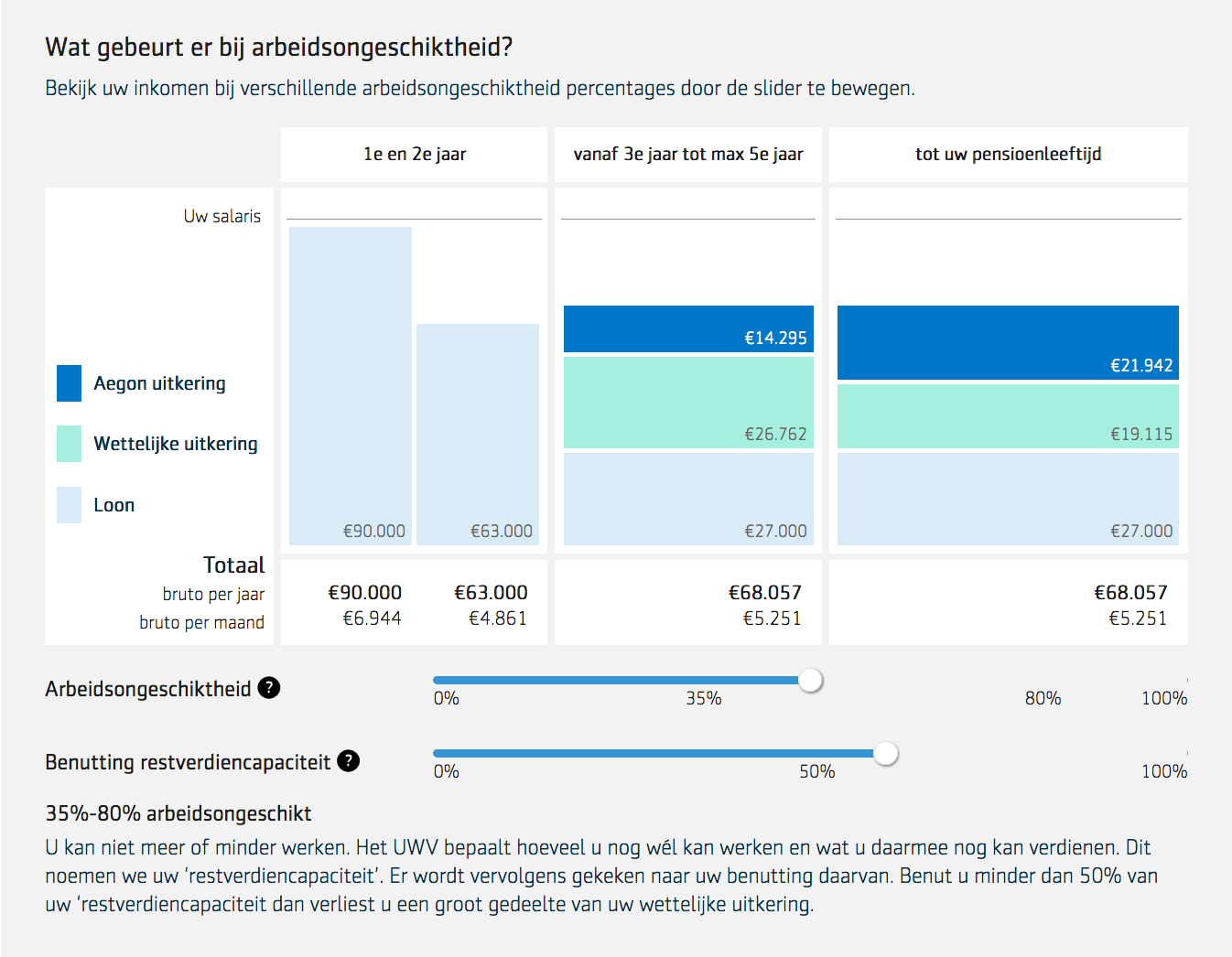
This was a compliance project - meaning a regulation was introduced that required employers in the Netherlands to show their employees what coverage they would have in case of disability.
Disability scenarios, laws and insurance products are fairly complex and regulations limit how much information can be simplified.
Redesigns
I worked in many redesigns, small, medium and large. Here is one
Old Pension Widget

Old pension widget
When users wanted to see their pension with Aegon, they would see an outdated and confusing design. Apart from the dated style, the old design did not prioritize information or showed a clear hierarchy of information. The main block was not relevant to the user’s main task and had a misleading name (there was no financial overview when following the link).
Additionally, pensions are a complex product with a very long life cycle. Different users require different information and functionality, depending on their age and other factors. The new design had to be flexible enough to accommodate for users at different stages of their lives.
New Pension Widget
The redesign was tested with participants several times.
The main focus in the new design answers their main questions - How much money do I have now? How much money will I have when I retire? Styling, layout, tab and behaviour of other components we reviewed collaboratively with other designers working for users of Mijn Aegon. We aimed at creating components that could be re used across different products - like mortgages and other insurance products.
New
New
New outcome flow