passion mind map
Data visualization books and history

Florence Nightingale’s diagram - 1858 one of the first versions of the pie chart. Known as a rose diagram but commonly called 'coxcomb', this graph, which resembles a pie chart, highlights the number of unnecessary deaths during the Crimean War as a result of preventable infections.

Flow map of Napoleon's 1812 march into Russia by Charles-Joseph Minard
The flow map traces the loss in soldiers during Napoleon’s Russian campaign in 1812/13. Drawn and printed in 1869.
Giving numbers visual form changed lives
Minard’s idea of giving thiker lines to numbers showed the impact on lives.
John Snow’s cholera outbreak mapping


why data visualization/diagrams
As a lover of geometric forms and abstraction, I am drawn to diagrams. They also describe relationships, in an obvious way ( number of stgh) and in many implied ways - the relationship of the person making the diagram to the rest of the organization, the relationship of the maker to visual things, the conditions in which it was made.
Working in companies I see many many visual artifacts - without question and continuity, many times determined by the type of sofware and habit rather than suitability.
background

Les perspecteurs (Abraham Bosse, 1648)
My own background is in Fine Art. Art and design overlap in many aspects (especially when looked from outside) but they differ in some key ways. Art offers more space for exploration, playfulness and freedom, more space for new and unexpected connections. It does not need to be useful.
Design is more strict
Thesis - Perspective is understood not as given property of space, or even an obejective representation of its properties, but as a culturally relative symbolic form. (Erwin Panofly’s Perspective as symbolic form).
So If perspective is not a property of space, and colour is not really a property of obejcts, what can we create when we take a step back and explore options?
The perspective we take will determine what we see and what we create. Could we use visual thinking to become more aware of our place and push our own boundaries?
Detail 3
What is the best type of chart for a specific type of data? What is the best way of approaching colour?
I LOVE colour theory
Loved the UDEMY COURSE
Different colour schemes better support different types of data.
Having fun learning Tableau and better understanding relationships between different data
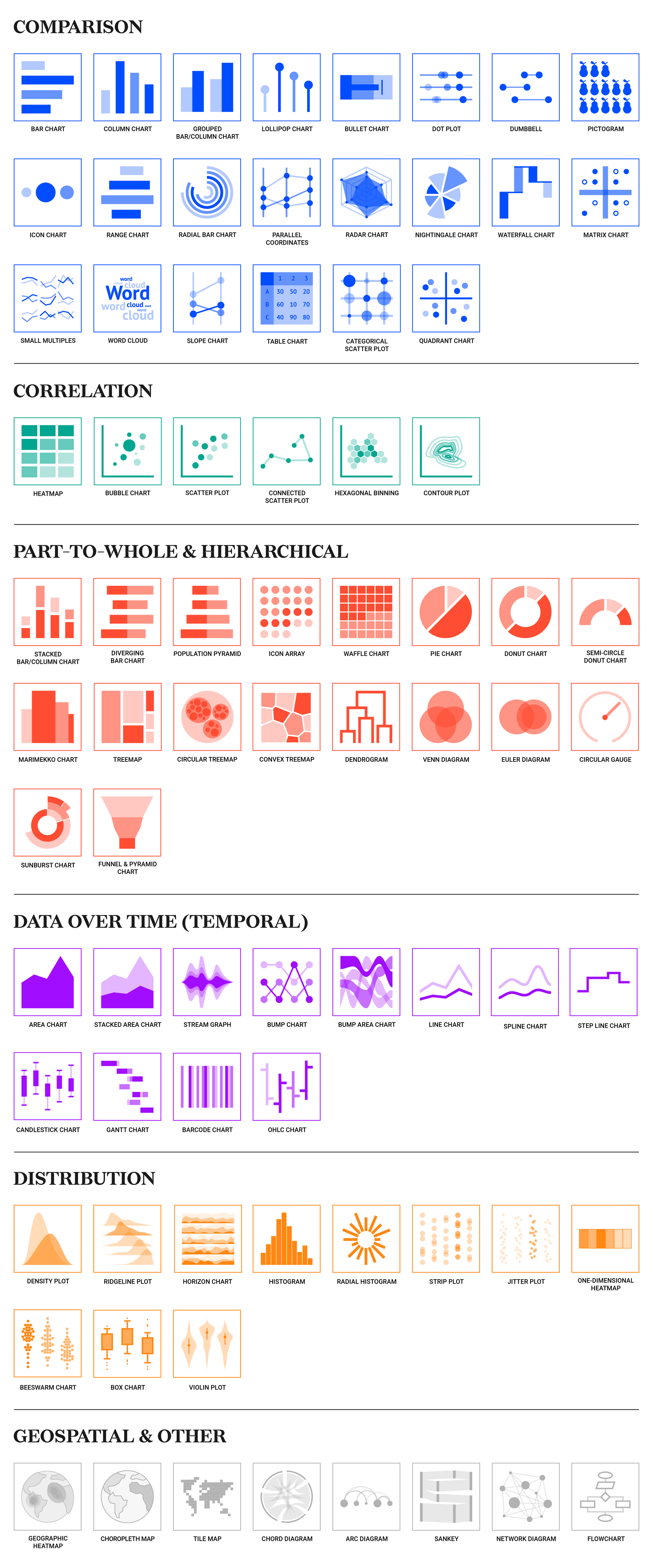
https://www.datylon.com/blog/types-of-charts-graphs-examples-data-visualization