Risk Profile checker Tool
problem
People with variable contribution pensions need to choose how much risk pension providers can take when investing his/her pension funds.
approach
Assessing a risk profile demands a lot of user input. To improve the experience, I broke the form into steps and grouped those steps, using visual comparisons, progress indicators and progressive disclosure to increase completion.
output
User flows, goal alignment, wireframes, interactive prototypes, usability testing, and visual design.
outcome
Increased completion rates and an award for best 2017 PensioenWegwijzer (Pension Show-me-the-way) award, for the Aegon ProfielWijzer (Profile Checker)
Mobile view new version
In November 2017, Aegon in the Netherlands won the 2017 PensioenWegwijzer (Pension Show-me-the-way) award, for the Aegon ProfielWijzer (Profile Checker). The jury said, 'This initiative demonstrates that by guiding people through their personal choices, they’re prepared to take decisions that can contribute to an improved pension.’
My role
I was the UX designer for this project, working closely with UX research, a behavioral economist, the marketing team for pension, external actuary services and our development team.
My goal was to clarify complex financial information, while encouraging completion and reducing friction for the user.
This was a compliance project with many heavily invested internal stakeholders, which added an extra layer of complexity.
Context
Depending on your type of pension plan, pension providers make investments with your pension funds, so that you have the chance of getting a higher pension. What kind of risk do you want to take with those investments? Low, neutral, high?
Users need to communicate their preference to their pension provider. This is not very easy for users, and in the past they would mostly rely on paying an advisor to do it for them.
A new regulation came into force that required pension providers to make better and clearer efforts in assessing how much risk people want to let pension providers run for them.
The metric for success was simple - increased number of customers who submitted their profile.
We were happy to achieve this, and more so to win an award for our tool.
Solution
To determine someone’s attitude to risk there were still many steps involved - enter financial information, users compare and choose between 5 different scenarios, confirm and submit the resulting profile.
Old Risk assessment tool
The old way of doing this had many usability issues (poor layout, no clear steps or progress indicators for example).
The new tool had to retain the ‘sunny’ vs. ‘rainy’ scenario comparisons. Many visual improvements were off limits due to the tight deadline and the complexity of the services involved.
Iterations for new version
Clear steps and progress indicators: However simplified, the process was still very long and complex. I broke the flow in clearer steps, using progress indicators and progress bars to give users an overview of the whole process, their place in it, and to encourage completion.
Visualizing: The calculations are based on someone comparing and choosing between different possible outcomes. I made the different scenarios clearer by visualizing and comparing them.
Progressive disclosure: Do not show everything at once, try to show only what is relevant at each step, and let users decide whether they want to drill down or not. Usability testing findings supported this approach - users did not want expert detailed knowledge, they want just enough to feel confident.
Key takeaways:
Keep the concept clear

Keep goals aligned
Projects where internal stakeholders are heavily invested, can easily lose customer focus.
If it is a compliance project, try to sit together with the legal department a few minutes - everyone should be on the same page as to what exactly the law requires, and what it does not. This is very important when evaluating different design solutions.
Just because the business goal is very important, don’t let the customer goal take the back seat - value happens where business and user goals meet. A simple goal alignment exercise can create the space for better value creation for everyone.
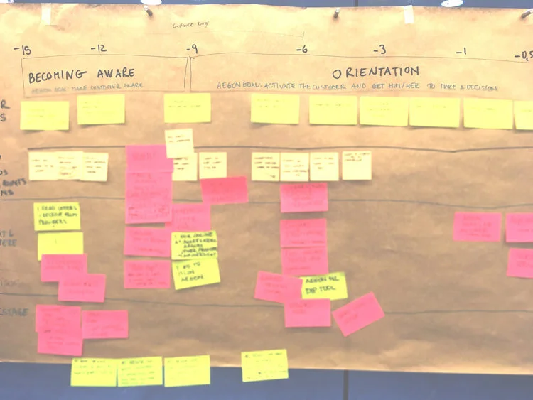
One of the main challenges of this project was communicating very complex concepts to users without overburdening them. What if you could explain these concepts progressively over time and through different channels? I facilitated a service blueprint workshop to support the marketing team in mapping out the user journey from beginning to end, to identify when and how better communicate with customers.
And of course, user test as much as you can.
Identify further opportunities
Identifying the key stages and pain points creates opportunities for better introducing complex concepts in stages, at the right time. This can help lower the cognitive load when making decisions over complex financial products.
If you would like to see more of my work at Aegon,
New outcome flow